Did you know that by 2025, over 75% of global web traffic will come from mobile devices?
That’s right, the way people experience the web is shifting dramatically, and if your business isn’t keeping up, you risk being left behind. Whether you’re looking for a Responsive web design Company in Ahmedabad or aiming for scalable growth, staying ahead is key.
Whether you’re running a growing small-to-medium enterprise or planning to scale up, understanding the future of Responsive Web Design isn’t just important, it’s essential. How can you ensure your website looks great, works flawlessly, and keeps your visitors engaged no matter what device they’re on?
In this blog, we’ll explore the key trends shaping Responsive Web Design in 2025 and share actionable insights to help your business not only meet but exceed user expectations. With the right Web Development Services, you can create experiences that delight your customers, drive conversions, and set the stage for long-term digital success.
Ready to discover how to turn these changes into your biggest advantage? Let’s dive in!
Ready to build a future-proof website?
Let Cravity Studio bring your vision to life.
Start Your Journey Today!
Why Will Responsive Web Design Make or Break Your Business?
Imagine this: more than 75% of web traffic will come from mobile devices by 2025.
So, how do you ensure your website keeps up and shines on every screen, from tiny phones to huge TVs? The answer lies in Responsive Web Design.
Think of Responsive Web Design as your website’s way of being smart and flexible. It adapts seamlessly to whatever device your visitors use, making sure everything looks great and works smoothly, no frustrating zooming or sideways scrolling needed.
Here’s the secret sauce that makes it work:
- Flexible Grids: Your site’s layout isn’t stuck in one size. Instead, it stretches and shrinks to fit perfectly on any screen.
- Fluid Images: Pictures adjust naturally so they always look sharp without spilling outside their frame.
- Media Queries: These clever CSS rules detect things like screen width, height, resolution, and orientation, then tweak the design accordingly.
But how does Responsive Web Design compare to other approaches?
- Adaptive Design creates specific layouts for different devices, but it can feel rigid and limited.
- Mobile-specific sites use separate URLs for phones, which can confuse users and split your traffic.
- Responsive Web Design, however, keeps everything unified, flexible, and future-ready.
Now, why does all this matter more than ever in 2025?
- Mobile-First Indexing: Google prioritizes the mobile version of your site for search rankings. If your site isn’t responsive, your SEO could take a hit.
- Better User Experience: Responsive sites load faster, are easier to navigate, and offer a smooth reading experience, all things visitors love. This means they stay longer and engage more.
- Higher Conversion Rates: A seamless experience across devices means more clicks turn into sales, sign-ups, or inquiries. Every interaction counts.
- Stronger Brand Image: Your website is often the first impression of your brand. A responsive design shows you’re modern, trustworthy, and customer-focused.
This is especially true if you’re competing in growing digital hubs like Ahmedabad or need custom website design in Gujarat.
So, are you ready to make your website work smarter and grow your business with Responsive Web Design in 2025?
Let’s keep going!
How Responsive Web Design Makes Life Easier (and Better) for Everyone
Responsive Web Design isn’t just about making your website look nice on different screens, it brings real, tangible benefits that can impact your business in big ways. Here’s how:
- Better Accessibility for Everyone
A responsive site naturally supports web accessibility, helping users with visual or motor impairments navigate your content more easily. And honestly, a site that’s easier for everyone to use is a win. - Saves Time and Money
Why build and maintain two versions of your website (one for desktop and one for mobile) when you can have one that works beautifully across all devices? Responsive design keeps things simple and cost-effective. - Faster Loading = Happier Visitors
Responsive websites are built with performance in mind, especially on mobile. Faster load times mean lower bounce rates, better user experiences, and even improved rankings on Google. - Reach More People, everywhere
People aren’t just browsing on phones and laptops anymore. Think tablets, smart TVs, and even wearables. A responsive site ensures your content looks great, no matter where it’s being viewed.
In short, Responsive Web Design helps you create a better experience for your audience while saving you time, money, and headaches. That’s what we call a smart business move.
Real Challenges in Responsive Web Design (And How We Solve Them)
Let’s be real, making a website look and work great on every screen isn’t always easy.
But at Cravity Studio, we’ve seen it all and know how to tackle the most common Responsive Web Design hurdles. Here’s how we help:
- Design Overload?
Complex layouts can feel overwhelming. We simplify things with clean, intuitive designs and flexible frameworks that scale effortlessly. - Slow Load Times?
Heavy pages are a no-go, especially on mobile. We fine-tune performance to make sure your site is fast, smooth, and efficient, without sacrificing good design. - Device Testing Headaches?
From smartphones to smart TVs, we test your site on real devices to guarantee a consistent experience across the board. - Too Much Content, Too Little Space?
We help you figure out what matters on smaller screens and structure your content so it’s easy to consume on any device.
The Cravity Studio Method: Building Smart, Scalable Websites
Creating a responsive website isn’t just about shrinking things down. It’s about smart planning, sharp tools, and constant refinement. Here’s a peek into Cravity Studio’s approach to doing it right:
- Start Small, Think Big
We use a mobile-first mindset, designing for smaller screens first to make sure the core experience is solid and scalable. - Modern Tools, Seamless Results
Frameworks like Tailwind CSS and Bootstrap help us move quickly and efficiently, without compromising on quality.
As a top UX/UI design studio in Ahmedabad, we combine clean design with robust functionality to deliver future-ready websites. - Optimized Media for Speed
We compress visuals and use next-gen formats, so your site loads quickly and looks great. - Test, Tweak, Repeat
We test across a wide range of devices, from iPhones to Android tablets to 4K monitors, so your site performs perfectly everywhere.
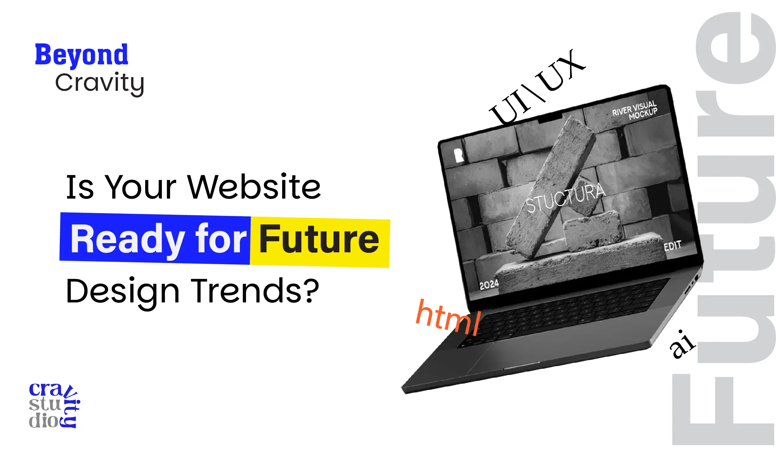
What’s Coming Next in the World of Responsive Design?
Responsive Web Design is no longer just about screen sizes, it’s about creating smarter, more personalized digital experiences. Here’s what’s on the horizon:
- AI-Driven Personalization
Websites will soon adapt in real-time based on how users behave, what they like, and what they need. - Voice Interface Design
As voice assistants grow in popularity, designing sites that respond to voice commands will be key. - Dark Mode Ready
Today’s users want control over their viewing experience, including the choice between dark and light modes. - Designing for Wearables and Beyond
With more people using smartwatches, AR glasses, and in-car displays, Responsive Web Design is expanding to meet users wherever they are.
Build a Future-Ready Website with Cravity Studio
As we move through 2025, one thing is clear: Responsive web design is no longer optional; it’s essential. In a fast-evolving digital world, your website needs to look stunning, load fast, and work flawlessly on every device your audience uses.
At Cravity Studio, we don’t just build websites, we craft seamless digital experiences. From mobile-first design and accessibility-first thinking to modern performance optimization, we ensure your site adapts, engages, and performs everywhere.
By embracing Responsive web design, you’re not just meeting user expectations, you’re exceeding them. Plus, with search engines now prioritizing mobile-friendly and fast-loading sites, your SEO performance naturally gets a serious boost.
So, if you’re ready to transform your digital presence and give your audience a website that truly delivers.
Get in touch with Cravity Studio today.
Let’s build a responsive, future-ready website tailored to your business goals. Because in 2025, a great digital experience is your biggest competitive edge.
FAQs
1. Why is responsive web design essential in 2025?
More than 75% of web traffic now comes from mobile devices. If your site isn’t optimised for all screen sizes, you’re losing users, leads, and SEO rankings. Responsive design ensures your website performs seamlessly across phones, tablets, laptops, and even TVs.
2. How is responsive web design different from mobile websites?
Mobile websites are separate versions made only for phones. They often have limited content and create confusion for users and search engines. Responsive design adapts your existing website layout to all screens, no duplication, no split traffic.
3. Can responsive design improve my SEO?
Absolutely. Google prioritizes mobile-friendly and fast-loading websites in its rankings. A responsive website enhances user experience, which reduces bounce rates and increases time on site, two key SEO factors.
4. My current website is slow on mobile. Can you fix that?
Yes! Slow load times are one of the biggest pain points we solve. At Cravity Studio, we optimize your site’s performance by compressing images, eliminating unnecessary code, and using mobile-first frameworks like Tailwind CSS and Bootstrap.
5. How much does it cost to create a responsive website?
It depends on the scope, features, and complexity of your project. But rest assured, we offer flexible pricing and scalable packages for startups, SMEs, and growing brands across Ahmedabad, Rajkot, and other cities in Gujarat.
6. Will my site look the same on all devices?
It will look perfectly adapted, not identical. Responsive design ensures that your website maintains brand consistency while adjusting intelligently to different screen sizes and resolutions.
7. Do you provide UX/UI design services too?
Yes! As a top UX/UI design studio in Ahmedabad, we focus on creating interfaces that are intuitive, beautiful, and conversion-friendly. Our design process is user-first, mobile-friendly, and performance-driven.
8. How long does it take to build a responsive website?
Depending on the complexity, it usually takes 3–8 weeks. We’ll give you a clear timeline after the discovery phase, and we ensure on-time delivery without compromising quality.