Industry: Skincare
Location: India
Services Provided:
- Brand Identity
- Logo Design
- Packaging Design
- Stationery
Brand Identity
Creating a brand identity for Triolab wasn’t just about a logo or colour palette, it was about crafting an emotional connection that speaks trust and innovation in the diagnostic skincare space. Triolab’s challenge lay in balancing its role as a healthcare brand with its positioning in the lifestyle segment. Healthcare demands precision and reliability, while skincare requires a touch of empathy and aspirational value.
Our first step was deep research into the competitive landscape and consumer psyche. We found that customers resonate most with brands that humanise clinical science, making it accessible without losing credibility.
We anchored Triolab’s brand identity around “Precision with Compassion”, a core philosophy that underpinned all visual and verbal cues. The typography chosen was modern and clean, reflecting scientific advancement. The colour palette featured soothing pastels paired with medical-inspired whites and blues, creating an impression of calm, hygiene, and trustworthiness. Visual elements included subtle motifs inspired by molecular structures, adding a layer of sophistication and relevance to skincare science.
Our branding guidelines extended into tone of voice and imagery. The voice was kept clear, professional yet approachable, enabling Triolab to connect equally with healthcare professionals and end-users. Imagery was curated to reflect real people, healthy lifestyles, and a sense of care, moving away from overly clinical or intimidating visuals.
This cohesive brand identity ensured every Triolab touchpoint—from websites and packaging to brochures—communicated a unified, emotionally engaging story. The result was a brand that stood out in a crowded market, positioning itself as both a scientifically advanced and deeply empathetic diagnostic skincare brand.
Logo Design
The Triolab logo needed to capture the essence of trust, precision, and progress. Healthcare logos often lean heavily into generic medical symbols, but we wanted something distinctive, an identity that feels at home in both clinical and consumer-facing settings.
Our design process began with conceptual sketches inspired by the intersection of science and human care. The final logo featured a clean, geometric icon suggesting interconnectedness, symbolic of Triolab’s holistic approach to diagnostics and skincare. The typography was custom-created for legibility and modern appeal, with rounded edges that soften the otherwise technical look, conveying warmth and approachability.
We carefully selected colours that evoke emotional responses: a calming teal representing trust and health, paired with subtle greys for balance and professionalism. The minimalistic design ensures scalability and versatility, allowing seamless application across mediums—whether on packaging, digital platforms, or even lab coats and signage.
The logo’s symbolic depth helped differentiate Triolab in the healthcare space, giving it a recognisable, premium presence that builds confidence among patients, partners, and practitioners alike.
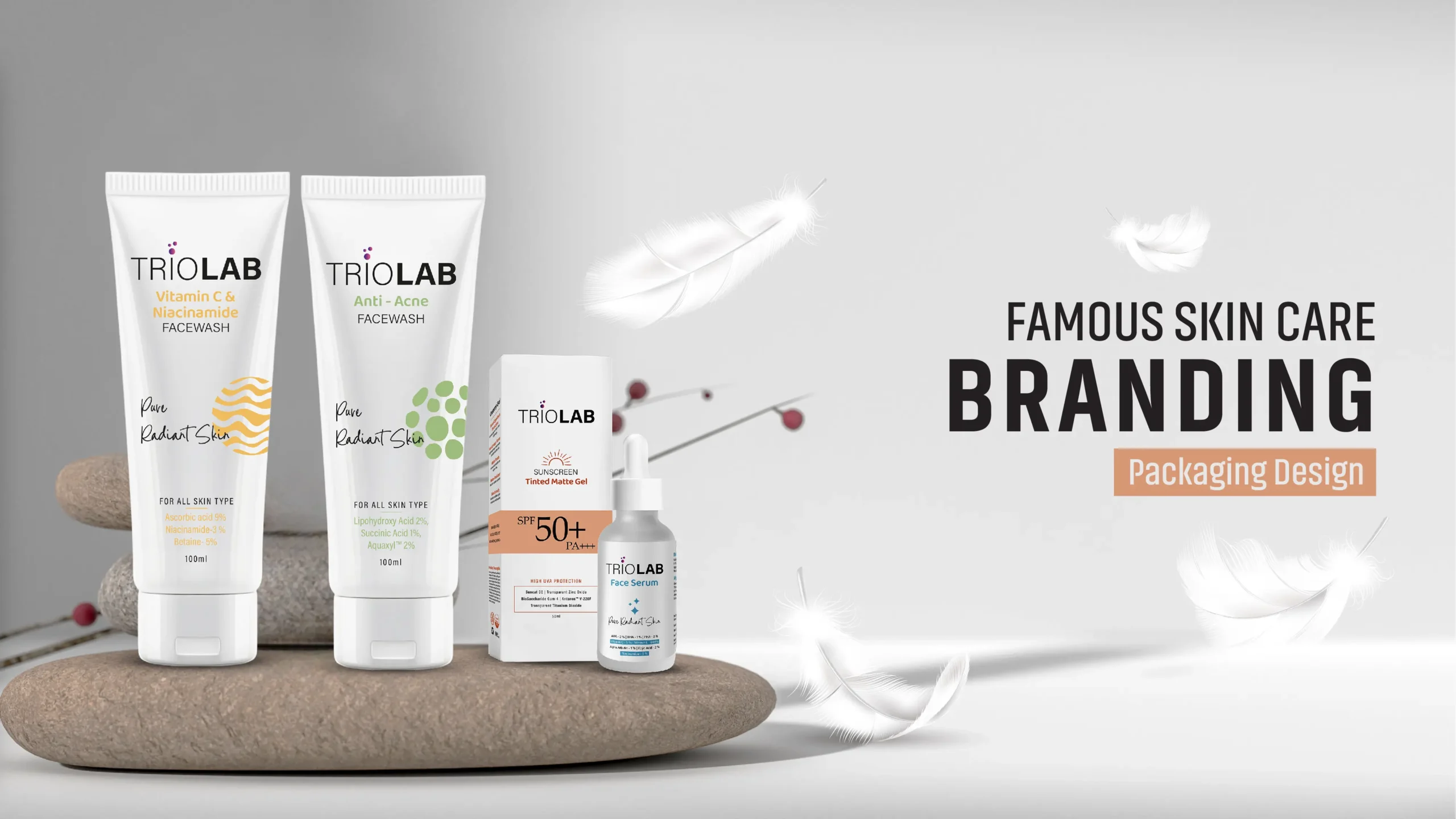
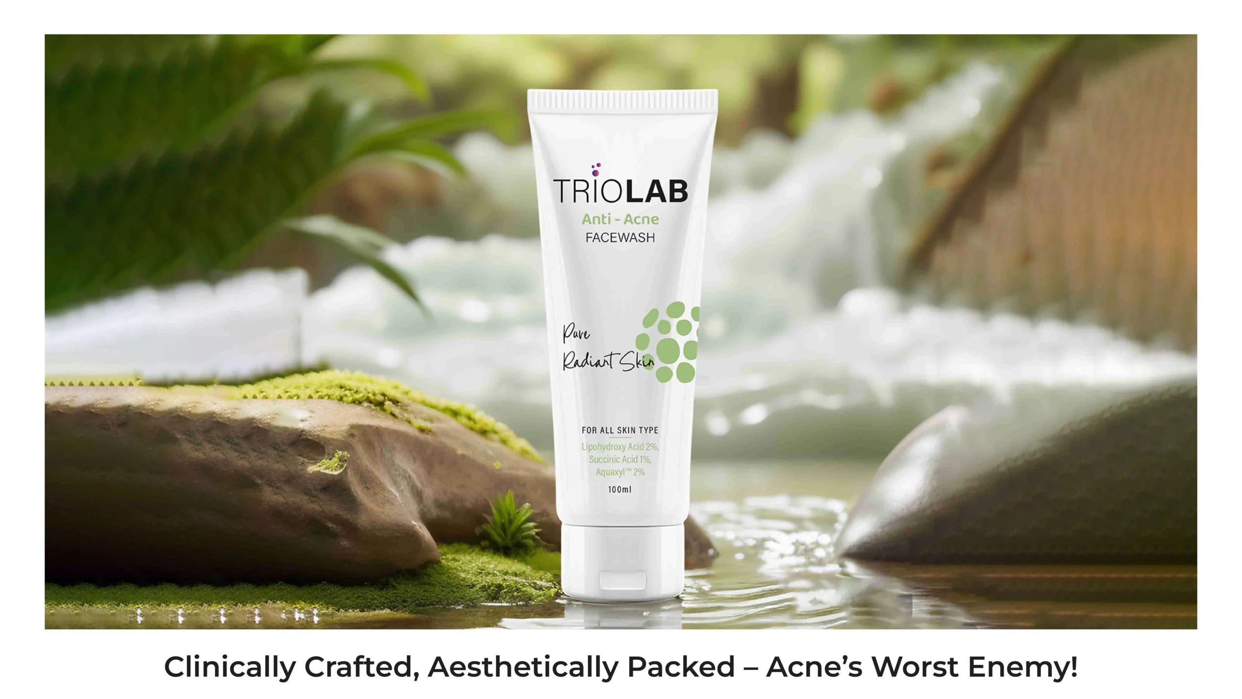
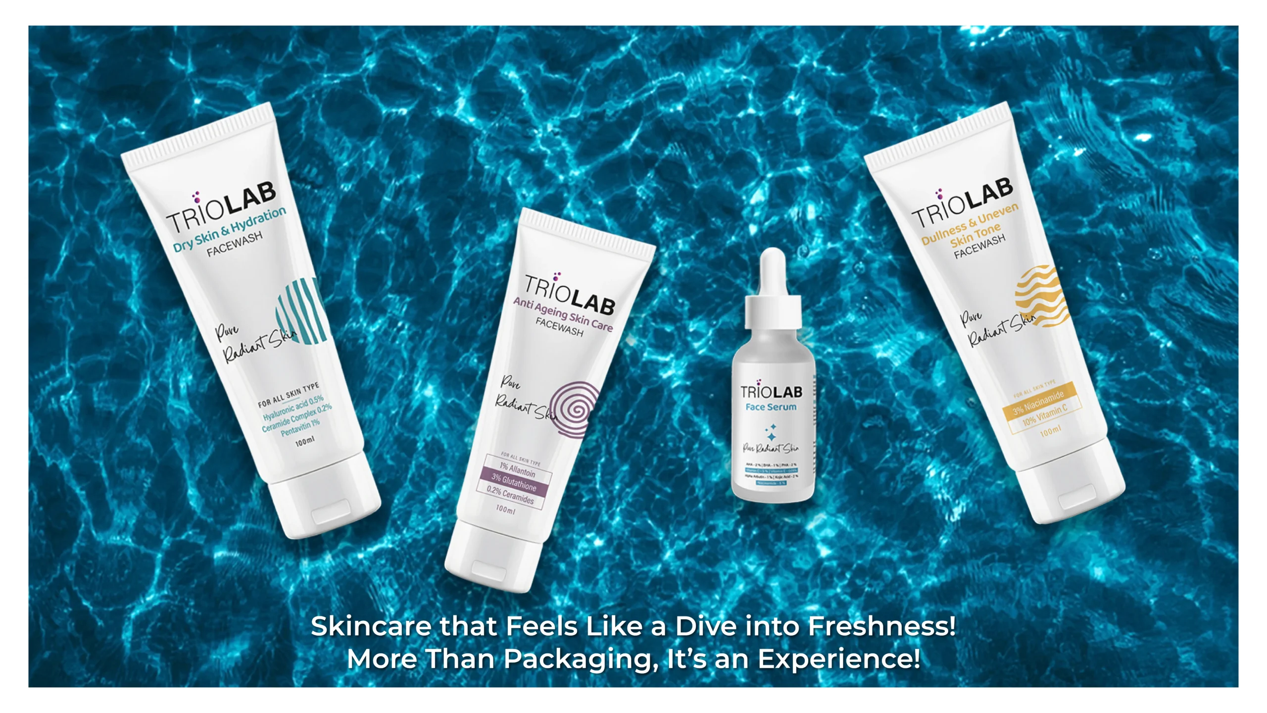
Packaging Design
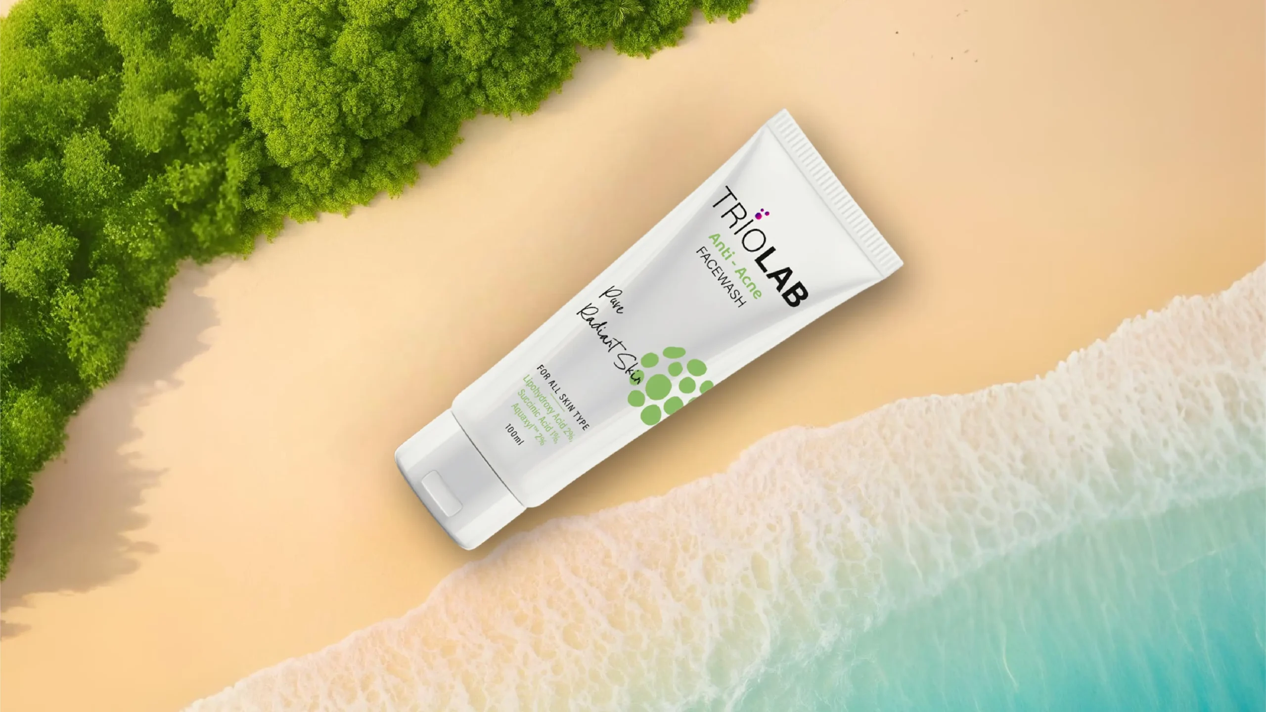
Packaging design for a diagnostic skincare brand like Triolab required us to consider both form and function. Our goal was to create packaging that stood out on the shelf yet complied with regulatory healthcare standards. Clean, uncluttered layouts ensured key information was accessible at a glance, an essential factor for consumers making quick decisions or healthcare providers handling the products.
We designed a modular system that used colour-coding to differentiate product lines—blue for diagnostic kits, green for skincare solutions, and lavender for wellness supplements. Each product carried intuitive iconography to aid recognition, especially for non-English-speaking users. Typography was kept crisp and high-contrast to enhance readability.
A premium matte finish, embossed brand elements, and subtle textures elevated the tactile experience of the packaging, reinforcing Triolab’s high-quality positioning. Sustainability was another key consideration. We opted for eco-friendly materials where possible, in line with the brand’s progressive ethos.
The result was a packaging design system that not only enhanced usability but also created a distinct visual language, making Triolab’s products instantly recognisable in clinics, pharmacies, and online retail platforms.
Stationery Design
Triolab’s stationery design extended the brand’s refined visual language to every corporate touchpoint. Business cards, letterheads, envelopes, and prescription pads were designed with minimalist layouts and high-quality materials to convey professionalism and trust.
Each item featured the Triolab logo prominently, paired with brand colours and subtle molecular patterns as design accents. Typography was kept consistent with the brand guidelines, ensuring legibility and an elegant, scientific tone.
The business cards used a premium matte finish with spot UV on the logo for a tactile, luxurious feel. Letterheads and envelopes carried clean layouts with ample white space, reinforcing the clinical yet approachable brand aesthetic.
This attention to detail ensured that every piece of Triolab stationery reinforced the brand’s values, whether in the hands of a healthcare professional, partner, or end consumer. The result was a seamless brand experience across digital and print communications.